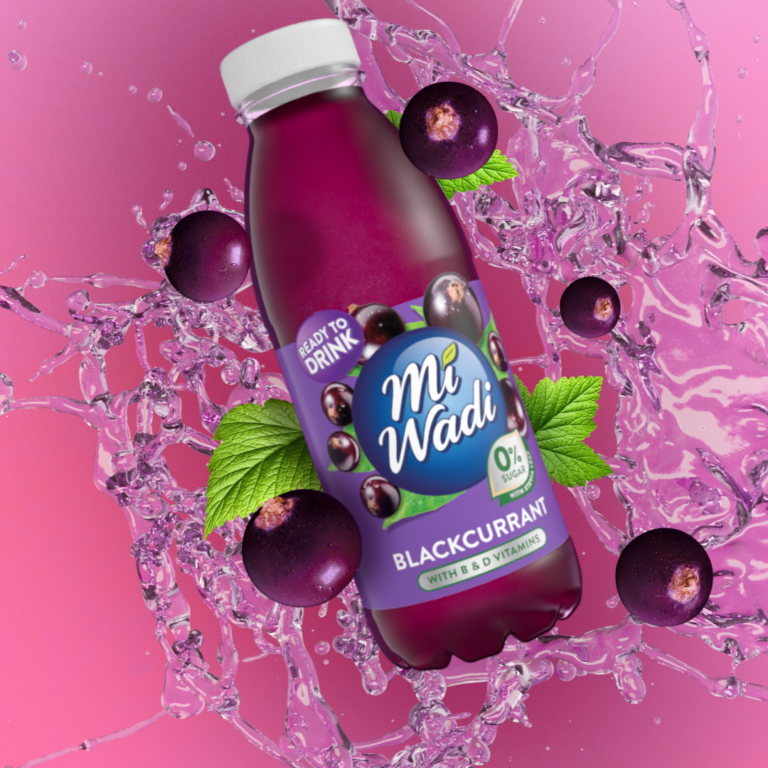
Misfits Brand Activation
Misfits were looking to explore motion language to elevate the brand and product across multiple platforms with particular emphasis on targeting Gen Z audience
Research and exploration
The creative director worked closely with me during discovery phase before deciding on a visual route. I began to build out animations based on the references we gathered from building a mood-board. We both felt the brand needed an injection of energy that would suite short form content aimed at Gen-Z. Visuals with a tactile feel appealed to the Gen-Z demographic who are accustomed to a clean sterile web 2.0 aesthetic. It synthesized against what Gen-Z are accustomed to in their social feeds.
Close up macro shots became a visual route that aligned with the energy needed in their brand. The shots gave the brand an upmarket feel with speed and fast paced visuals provided the snappy eye catching motion Misfits.
Defining visual elements
The creative started to take shape by exploring different styles of animated copy and product visuals. A deliverable asset began to form allowing myself and the Creative Director to identify what we both felt worked.
Defining Form
We now moved into the final phase of the project. A functional creative needed to be more defined and polished. We started working with the in-house design team to establish consistent visuals that formed deliverables for use in marketing material.
We started to build a visual language with copy, pack shots and up-close Macro shots of food. The design team provide the decal sticker which were animated by myself.
Promotional Creative
Halloween Campaign
Speculoos is back campaign
Creative and motion had come together to create a fully formed deliverable. A consistent style of animation, text and framing is now defined to develop marketing material that aligned with the initial goals of the project.


